
Visuals That Convert Before the Click
🧠 The Visual Loop Engine: How to design visuals that convert before the click, Google’s new Hands-Off Ad era, and more!


Howdy readers 🥰
In this newsletter, you’ll find:
🧠 The Visual Loop Engine: How to Design Visuals That Convert Before the Click
📲 Google’s New Hands-Off Ad Era
🏆 Ad of the Day
If you’re new to ScaleUP, then a hearty welcome! You and 50k+ CEOs, CMOS, and marketers have reached the right place. Let’s get into it, shall we? Oh! Before you forget, if someone forwarded this newsletter to you, don't forget to subscribe to our newsletter so you never miss out!
Together with Motion
What If You Could Review Ads With the Same Eye as the World’s Best Creative Strategists?

Now you can—with none of the wait.
Introducing: Motion’s Expert Agents – AI-powered workflows created by the world’s best creative strategists.
Easily analyze creatives, spot weaknesses, and improve performance—without bottlenecks.
Each workflow is built by real experts like Dara Denney, Barry Hott, Mirella Crespi, Jess Bachman, Alex Cooper, and Jimmy Slagle—leaders who actively manage and grow high-scale ad accounts. 💵
These agents bring their strategic thinking to your team’s fingertips, helping you solve everyday creative problems with speed and clarity.
What used to take marketers hours now takes just minutes—with zero compromise on quality.
If better, faster creative decisions sound like something your team needs...
Get early access to Expert Agents today!
🧠 The Visual Loop Engine: How to Design Visuals That Convert Before the Click
Modern commerce doesn’t begin with a click—it begins with a glance. We now operate in the Visual Addiction Economy, where conversion depends less on copy and more on whether your visuals hijack the brain’s predictive loop.
But the smartest marketers aren’t chasing aesthetics—they’re building engines. Here’s how to design a high-converting visual loop that creates anticipation, narrative, and action… before the user even scrolls.
1. Neuro-Architecture: Building Predictive Loops That Reward the Brain
Humans don’t process visuals linearly—we predict what’s next. Every time your design layout, image sequence, or animation leads the eye to a payoff, the brain gets a dopamine hit for “being right.” Do it repeatedly, and you form a neural loop that feels addictive.
Execution:
• Design visual sequences where elements “complete” with user interaction: hover reveals, color transitions, or subtle progress indicators.
• Use spatial flow to guide perception. A product image pointing toward a CTA increases click-through rate simply by leveraging directional bias.
This is architecture—not design.
2. VLaaS: Visual Loops-as-a-Service
Don’t just design landing pages. Design “visual loops” that users come back for.
What is a visual loop?
It’s a self-contained, ever-refreshing unit of motion or content that delivers a consistent micro-reward. Think:
• Auto-updating social proof carousels
• Dynamic UGC collages that refresh with each visit
• Micro-animations tied to scroll velocity
Semrush and Euromonitor’s latest ecommerce report confirms the rise of visual-first engagement across mobile and AI-powered journeys—You can get your report for free here!
The play here isn’t novelty. It’s rhythm. You’re creating a passive habit-forming loop where the visual structure itself builds trust and memorability—like a UX metronome.
3. Visual Closure = Conversion
In comic books, the most powerful moment happens between panels—the reader’s brain fills in the action. Your visuals should do the same.
Instead of showing everything, create visual “gaps” that force cognitive completion:
• A cut-off product photo with a CTA to “Reveal Full Look”
• A testimonial headline without the face—until scroll triggers it
• A video freeze-frame hinting at a transformation mid-process
Why it works: completion equals satisfaction. And satisfaction drives the impulse to click.
Great visuals don’t just decorate the user experience—they engineer it. If you’re not designing for loops, predictions, and closure, you’re designing to be ignored. Build visual systems that don’t just get seen—they get remembered, interacted with, and bought into.
📲 Google’s New Hands-Off Ad Era
Google is doubling down on AI and automation across Ads, Search, and Analytics. From visual-first Demand Gen creatives to automatically scraping email content for listings, the changes signal a future where your marketing assets are optimized by default—for better or worse.
The Breakdown:
1. Landing Page Screenshots in Ads - Google Demand Gen campaigns now show landing page screenshots within the ad creative which is enabled by default for some boosting engagement. A/B testing creative variants just got visual, making first impressions more crucial than ever.
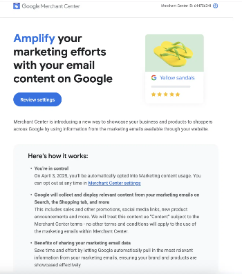
2. Email Content Auto-Sync with Google - Google will now auto-subscribe to your email campaigns to extract content—like promos, social links, and brand visuals—for display across Search, Shopping, and Maps. Marketers are automatically enrolled but can opt out via Merchant Center settings.
3. Google Analytics Gets Plain-English Insights - New "Generated Insights" automatically explains conversion spikes or traffic drops using natural language. It analyzes multiple metrics to identify causes, making it easier for non-technical teams to act fast on performance trends.
Google’s automation wave means your landing pages, emails, and brand content could appear in more places than you expect—whether you planned for it or not. Adapt or risk falling behind in the AI-first marketing future.
🎥 Ad of the Day
What Works:
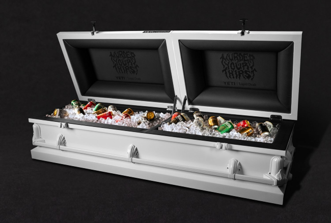
You’re seeing ice-cold beverages packed inside a white casket. This triggers cognitive dissonance — and that’s the point. It forces the viewer to pause and think. It's edgy, eerie, and unforgettable, which aligns perfectly with Liquid Death’s core brand DNA
Inside the coffin, you see the brand’s campaign line: “MURDER YOUR THIRST. This isn’t just wordplay — it’s now a visual metaphor. The thirst is dead and buried, literally. The brand just killed it with product, ice, and punchline — and made it Instagram bait.
Yeti is known for elite-grade coolers. That logo grounds the ad in functional credibility. Liquid Death brings the culture, Yeti brings the utility. The collab feels purpose-built, not random.
Broader Insights:
From font style (death metal typography) to color scheme (ice on black) to set design (studio lighting on a white coffin), it’s brand-coded to the pixel. This is more than a visual — it’s a content format waiting to be remixed by creators, fans, and influencers.
Advertise with Us
Wanna put out your message in front of over 50,000 best marketers and decision makers?
We are concerned about everything DTC and its winning strategies. If you liked what you read, why not join the 50k+ marketers from 13k+ DTC brands who have already subscribed? Just follow this.
At ScaleUP, we care about our readers and want to provide the best possible experience. That's why we always look for ways to improve our content and connect with our audience. If you'd like to stay in touch, be sure to follow us EVERYWHERE🥰
Thanks for your support :) We'll be back again with more such content 🥳